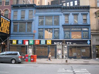
Plenty of people have blogged this building on 22nd and Broadway for one reason or another. Hard not to. There’s always something oddly compelling about the disintegration of signage. and the increasing obscurity of type as its original message deteriorates into ambiguity. Maybe it’s the Wheel Of Fortune-esq similarity, and the way our brains try to fill the gaps and make sense of the words. It’s a magic trick in itself of “now you see it, now you don’t.”
There’s also something about the color here, the mood indigo building itself is easy on the eyes and feels oh so good in a world of color and signage that clobbers you with alarming mediocrity. Yellows and reds can grab your eye, but an entire blue building with a thin band of black trim and superimposed type is like some sort of layout, like a giant book jacket for this building’s story within.
Can’t really see the details here, but this was a magic store that moved locations. Its windows still retain the hand-painted lists of contents inside: Balloons, Chinese lanterns and Halloween supplies. It’s circus chic without the grotesque. Playful like a gumball machine or coin-operated rocket ship ride outside an old supermarket.


0 Comments:
Post a Comment
Subscribe to Post Comments [Atom]
<< Home